Creating a wedding website was one of the first wedding-related projects I undertook. Ken is a web developer and would cringe any time we would receive a wedding invitation that included a 40-character long URL to their wedding website hosted at The Knot, so I knew that we’d have to have our own domain.
But, right after out engagement, he told me that he had already registered a personalized domain just for our wedding. How sweet! But now, it was up to me to actually create the site.
I wanted something minimalist and that didn’t require a whole lot of coding knowledge because, while I knew that I could ask Ken any time I had a question, I didn’t want to bother him with it.
I installed WordPress on our customized domain and then found a theme called Adventure that I really liked after probably WAY too much searching. Our website originally included six pages:
- Home Page – Just consisted of a menu bar and a slideshow of images of the two of us
- The Engagement – The story of how we got engaged
- Wedding Details – This page included information about our venue, the date and time of the ceremony and reception, attire suggestions, directions, and information on accommodations and hotel room blocks. We also included a brief story about our wedding venue hunt and how we chose Prince William Forest Park.
- About Us – Details about ourselves like where we work, where we went to college, and what our hobbies are. This was good so that each side of the family could learn more about us!
- Registries – Contained links to our registries
- Contact Information – Our e-mail addresses and a link to our wedding Facebook group (more on our Facebook group in a future post)!
Subsequently, we added two additional pages
- RSVP Here! – Since we provided an online RSVP option for our guests
- Wedding Photos – After the wedding, we provided links to all our wedding photos on our website. Then mentioned in our wedding thank you cards that folks could check out our site and view all the photos. (Although we had put all our photos on Facebook, there are a considerable number of folks not on Facebook who hadn’t seen them).
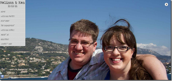
Here’s what our homepage looks like:
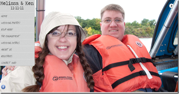
The large photo changes every 3 seconds (in every browser except IE. IE users only see this photo). We had 38 photos of ourselves that would rotate through on the page.For instance, here’s another photo:
There you have it!
I really, really loved the simplicity of our wedding website. I installed Google Analytics code on the site, and so I could see how many of our guests actually checked the website after we sent out our Save-the-Dates. It was great!
What did you all do for your wedding website?


